5 Things To Know About NDVI (Normalized Difference Vegetation Index)
As one of the most popular vegetation indices, the Normalized Difference Vegetation Index (NDVI) is a valuable way to understand vegetation health and land use remotely.
With the amount of remotely sensed imagery from Earth Observation (EO) satellites increasing year after year, easy-to-use indices such as NDVI help to extract information from this wealth of data.
There are plenty of resources out there on NDVI, but it can be challenging to know where to start.
That’s why we’ve rounded up the top five things we think you should know about NDVI and how it all works:
1. What is NDVI?
Essentially, NDVI is an indicator of vegetation health based on how plants reflect certain ranges of the electromagnetic spectrum.
The electromagnetic spectrum is central to us understanding plant health. It is fundamental to how NDVI works and allows us to determine how healthy, or unhealthy; a plant is based on how it reflects energy and light.
To the human eye, a plant is green because the chlorophyll pigment in it reflects green waves and absorbs red waves.
Cell structures in plants reflect the near-infrared (NIR) waves. So, when photosynthesis occurs, the plant develops and grows and contains more cell structures.
This means that a healthy plant—one with a lot of chlorophyll and cell structures—actively absorbs red light and reflects NIR. An unhealthy plant will do the exact opposite.
This relationship between light and chlorophyll is how we can use NDVI to tell apart a healthy plant from a diseased one.
Healthy plants actively absorb red light and reflect near-infrared light.
Satellite sensors in space measure wavelengths of light absorbed and reflected by green plants. They are an excellent source of spectral signature data for NDVI analysis.
The NDVI index detects and quantifies the presence of live green vegetation using this reflected light in the visible and near-infrared bands.
Put simply, NDVI is an indicator of the vegetation greenness —the density and health—of each pixel in a satellite image.
When was NDVI created?
NDVI was created in 1973 when a research team at Texas A&M University studied data beamed back from earliest Earth observation satellites orbiting the Earth.
Their imaging instruments recorded wavelengths of infrared light reflected by vegetation on the ground.
Using data from Landsat 1, the team mapped regional vegetation changes across the growing season. For every pixel of land, they processed wavelengths of reflected light into an NDVI that closely approximated plant cover and health.
Since then, NDVI has been a window into plant health around the world.
The index is useful in many ways and for many purposes. From helping farmers do precision agriculture to allowing conservationists to understand ecosystem changes.
It allows land to be monitored in any area of the world using a simple calculation.
Speaking of, let’s explore that next.
2. What’s the formula for NDVI?
We need to compare the values of absorption and reflection of red and NIR light to understand how healthy a plant is.
The simple mathematical formula (below) calculates the NDVI and, in turn, transforms raw satellite data into vegetation indices.

The NDVI formula combines the information available in the red and NIR bands into a single and representative value.
It does this by subtracting the reflectance in the red spectral band from that in the NIR. Then, it divides this by the sum of the NIR and red reflectance.
The value of the NDVI will always fall between -1 and +1.
Values between -1 and 0 indicate dead plants, or inorganic objects such as stones, roads, and houses.
NDVI values for live plants range between 0 to 1, with 1 being the healthiest and 0 being the least healthy. A single value can be determined for every pixel in an image—ranging from an individual leaf to a 500-acre wheat field.
What can NDVI tell us about plants?
As a plant canopy transforms from the depths of winter dormancy to late-summer maturity, its reflectance properties also change. NDVI can help you to keep track of this seasonal variation.
It’s important to know that the NDVI is an indicator of the plant’s health and not a way to diagnose a particular condition. It’s more a set of quantifiable clues on what is currently happening on the field for you to equip yourself with. Drought, disease, pests, or floods are among the many factors that could be affecting vegetation and in turn, its NDVI values.
Thus, conducting NDVI analysis can direct you on where to investigate further or do broader damage assessment if you already know which factors are influencing plant health.
3. What NDVI color map scales are in tools like QGIS?
By transforming satellite data into NDVI values, we can create images that provide a measure of vegetation type, quantity, and condition.
If you have a value for every pixel, you can assign different colors to different ranges of NDVI values. This way, create a false-color map of how NDVI varies spatially.
GIS tools like QGIS, GRASSGIS, ArcGIS, and many more make this possible.
NDVI calculators take imagery from an optical satellite and calculate NDVI, producing a georeferenced raster output.
After opening this output in QGIS, there are many possible color map scales to choose from and apply to the raster symbology.
There is no standard color map for NDVI mapping, however, one that closely resembles reality—with high NDVI value areas appearing more green—is widely used.
Known as stoplight color maps, the scale emulates a stoplight and applies a red-yellow-green palette to NDVI-processed imagery.
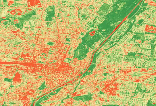
For example, shown above is an image of Munich taken by Pléiades in 2019. Places with healthy vegetation are seen in the green areas of the image. Red areas indicate those with no live green biomass.
The red area on the lower left of the image is Theresienwiese—a usually green and open space that was at the time, home to Oktoberfest.
Since the festival tents were covering the meadow, the healthy green vegetation was not visible from space and so the NDVI algorithm processed this as area red.
The darker green area, top right of the image, is the Englischer Garten. With an area of 3.7 km2 , it is one of the world’s largest public parks and contains dense, live green vegetation, so the area appears green. Orange-yellow areas indicate bare soil or dead/sparse vegetation.
Stoplight color maps such as this are generally seen as more intuitive, with green signally healthy and red highlighting hotspots of concern, or areas lacking vegetation.
Alternative color scales such as NASA’s blue-brown-green process values close to zero as shades of brown, representing bare soil. NDVI values close to 1 represent live vegetation so green is used, similar to the stoplight color scale. Negative values are displayed as blue, representing water.
Another type of color scale turns images into ‘heat maps’ of photosynthetic activity by painting high NDVI values with hotter colors.
Whichever scale you choose, assigning colors to create detailed color maps of regions allows you to identify where plants are thriving and under stress over time.
4. Useful data sources for NDVI
It all starts with satellites in outer space. As we know, after sunlight illuminates a plant, satellites capture the reflected wavelengths and paint a picture of the planet for us.
Sensing the globe around the clock, satellites such as Landsat, Sentinel-2, Pléiades, and SPOT produce images with red and near-infrared bands—ideal for NDVI.
One thing to note is that different satellites have different wavelength definitions for bands, which could mean slightly different results comparing NDVIs from different satellites. That’s why all of the band information for the satellites on the UP42 platform is readily accessible in their documentation pages.
Some other things to consider when selecting your data, especially for comparative analysis, are atmospheric influence, calibration errors, and even orbital overpass time as these can influence your results, either diminishing or exaggerating the reflectance.
We looked at imagery from Pléiades in the aforementioned NDVI color map of Munich. Pléiades provides us with very high resolution 2m multispectral data.
But, accessing and purchasing satellite data can be difficult. With so many satellites streaming back a wealth of information around the clock, how do you know where to find the right source for you? And, how do you go about purchasing it over your area of interest (AOI)?
This list of all Earth Observation satellite imagery data sources is an open-source resource containing all satellite systems and their parameters. Scour it to find a growing list of optical, as well as radar satellites, their spectral bands, sensors, and more.
Next, the UP42 platform offers ready-to-use data from a variety of providers, including OneAtlas and Sentinel Hub. Simply click through and create workflows using the data source of your choice, over your AOI, and combine it with NDVI processing algorithms.
5. NDVI algorithms to use with EO datasets
Turning terabytes of satellite imagery into handy NDVI color maps with the click of a button is no easy task. Especially, doing this at scale and across wide areas of interest over time.
That’s why we rely on algorithms to do the heavy lifting for us.
NDVI algorithms are trained to work with satellite imagery to calculate NDVI and produce an easy-to-work-with georeferenced output as a result.
As we now know, NDVI algorithms calculate the NDVI value for each pixel of your AOI, assigning each one a value in the range of -1 to 1.
Let’s recap
Firstly, NDVI is a pixel-wise mathematical calculation rendered on an image using GIS tools. It is an indicator of plant health, calculated by comparing the values of absorption and reflection of red and near-infrared light.
With NDVI, land around the world can be studied, making it useful for both targeted field analysis, as well as continental or global-scale vegetation monitoring.
Intuitive, spotlight color maps paint healthy, dense vegetation as green.
By using NDVI we can gain an instant analysis of fields, allowing agriculturers to maximize field yield potential, minimize environmental impact, and tailor their precision agricultural practices.
Looking at NDVI alongside other data streams such as weather data can give further insight into patterns of drought, frost, or floods that affect vegetation.

Subscribe to our newsletter
Stay up to date and learn about our fast-growing new features