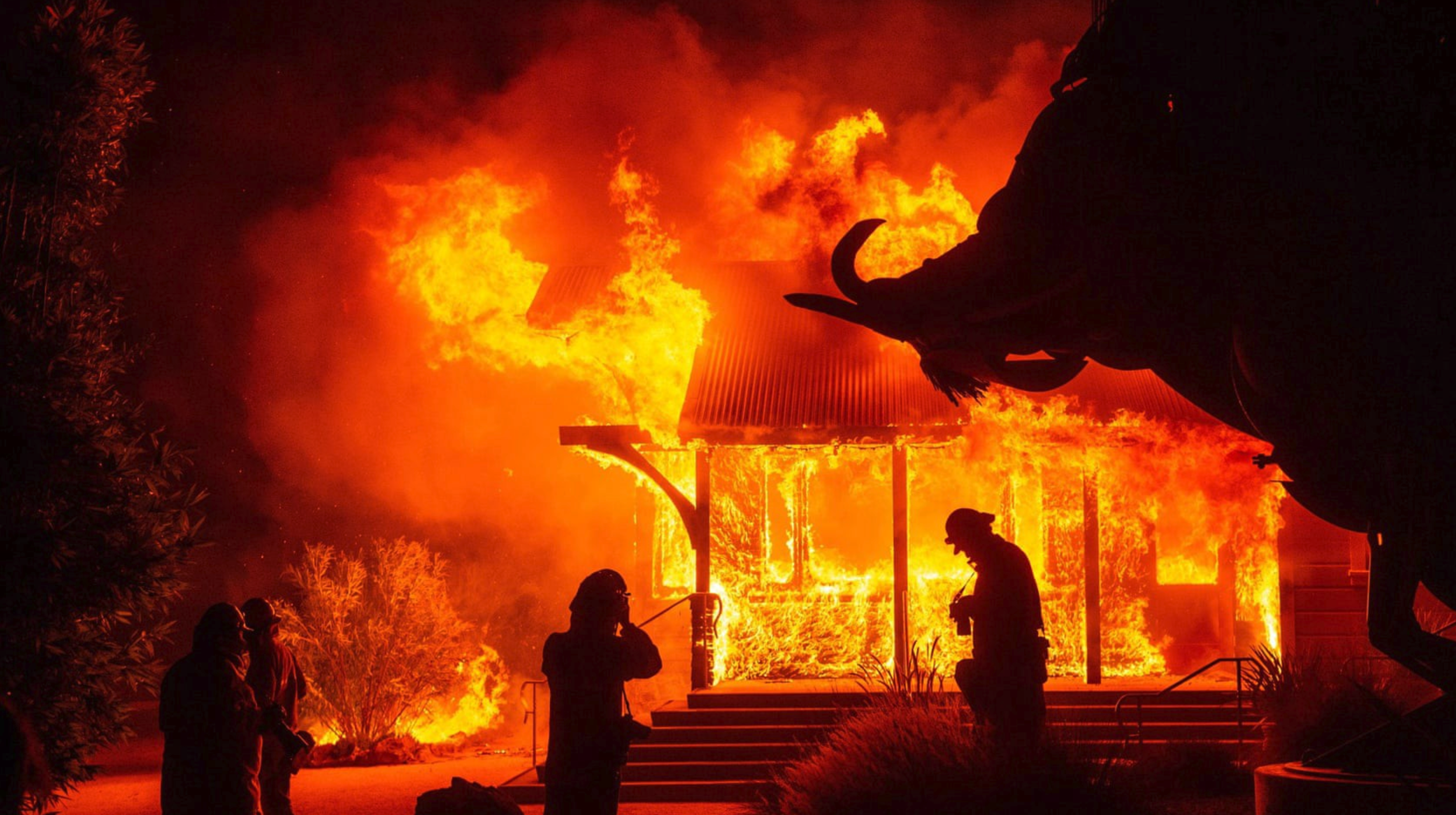
The Kincade Fire started in California on the night of Wednesday 23 October 2019 and has since then burned through more than 66,000 acres of land. A combination of strong winds and dry weather has continued to push the blaze further into Sonoma County, causing several mass evacuations including 180,000 people in Santa Clarita, California.
Californian Governor Gavin Newsom declared a state-wide emergency as wildfires whipped up by fierce winds sweep through the area. Pacific Gas & Electric, the electricity provider in California has been shutting down electricity for about 700,000 people to safeguard against additional ignitions in what the utility called the “most powerful weather event in California in decades”.
It’s clear that wildfires are a big problem. But what can we do?
Being able to understand and respond to fires and minimize their destruction depends on access to information.
However, it is sometimes difficult for people far away to judge the level of devastation on the ground and the impact such natural disasters can have on people’s lives and communities.
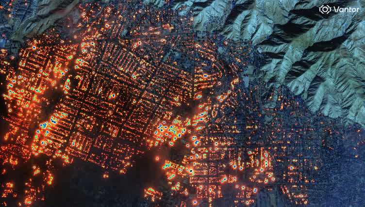
Satellite imagery can provide a helpful, high altitude perspective on fires.
From high in space, they are perfectly positioned to see the scale of the situation. This helps to potentially engage the whole society and planet on a global scale in order to inform and drive much-needed change.
MODIS, the Moderate Resolution Imaging Spectroradiometer, is one of the satellites that can quickly provide information in such a high stake situation. Operated by NASA and launched in 1999, it is composed of two instruments: Terra with a North to South morning orbit and Aqua with a South to North afternoon orbit.
Together they image the entire Earth’s surface almost every day. With a massive 2330 km swath (this is the width of a single satellite picture) and a resolution of up to 250m, MODIS captures images in 36 different spectral bands.
 Above: NASA’s MODIS images the entire Earth’s surface almost every day. (Source: NASA)
Finding data
At UP42, we have integrated MODIS data as a data block that you can easily use. In this article, we will quickly show you how to get up-to-date imagery of the Kincade Fire simply by using the UP42 platform.
First, we create an account at up42.com and claim our 10,000 free credits.
Second, we create a Project in the UP42 console — in this case, we’ll call it Kincade Fire. Find out more about projects and workflows in UP42 documentation.
Third, let’s create a Workflow, name it MODIS and add the MODIS AOI Clipped data block. Configure the Job with the AOI selector using the parameters below. This is the stage where we can really pinpoint the area and time period we are looking at.
 Above: The AOI Selector. Copy and paste the parameters below into the JSON editor.
{
"nasa-modis:1": {
    "bbox": [
      -122.828447,
      38.527647,
      -122.710804,
      38.612902
    ],
    "imagery_layers": [
      "MODIS_Terra_CorrectedReflectance_Bands721"
    ],
    "limit": 5,
    "time": "2019-10-23T00:00:00+00:00/2019-10-27T23:59:00+00:00",
    "zoom_level": 9
  }
  }
In order to get a better visualization of the burned area, instead of fetching the Red-Green-Blue image (RGB) we select one of the other products produced by MODIS — taking advantage of additional spectral bands, particularly bands 7, 2 and 1.
This way, we can better understand how colors translate into information. Burned areas or fire-affected areas are characterized by deposits of charcoal and ash, removal of vegetation and/or the alteration of vegetation structure.
When bare soil becomes exposed, the brightness in band 1 may increase, but that may be offset by the presence of black carbon residue; the near-infrared (band 2) will become darker, and band 7 becomes more reflective. When assigned to the color red in the image, band 7 will show burn scars as deep or bright red, depending on the type of vegetation burned, the amount of residue, or the completeness of the burn.
The color composite of bands not representing true Red-Green-Blue is usually referred to as a False Colour Composite. The full list of available composites to fetch with the MODIS block can be found here.
Fourth, we run the Job!
Fifth, we receive our results. We click on the Download button and a zip file containing two GeoTiff images will be downloaded.
 Above: The UP42 Job result page. Click on Results > Download to download the GeoTIFF files onto your computer.
Now we can open these images on our regular image preview software, or use QGIS for further processing or analysis with other data sources. We can also use Juxtapose to create a nice-looking slider comparison and publish it online, just like the one we made below.
Above: Comparison of MODIS Terra imagery of the Kincade Fire from 23–10–2019 and 27–10–2019. (Source: UP42)
Understanding imagery
After downloading the images, let’s take a closer look at what they’re telling us.
In the image from 23 October—taken before the fire began—we can see that the color is relatively stable across the image and that the vegetation looks relatively healthy and very green throughout. Some regions appear more yellow—indicating no vegetation or dry vegetation.
Note that MODIS resolution (250m) results in mixed pixels. This means that one pixel in the image contains several features — such as vegetation, buildings or roads. This is why MODIS is most useful for a “broad stroke” analysis of the area.
The image from 25 October (below) and 27 October (above) is radically different. Further north we can see the burned regions as dark red/yellow areas—signifying the presence of ash and charcoal in the entire pixel region. We can also clearly see the active fire area as a very bright red color, including significant smoke covering all regions southwest of the active fire area.
 Above: MODIS satellite imagery of the Kincade Fire taken on 25–10–2019.
Satellite imagery is an excellent tool to investigate and track events on a global scale. The imagery we downloaded in this article tells us how the Kincade Fire behaves over time and gives us an overview of the environmental consequences.
It’s important to consider the type of satellite we use to track wildfires from space. In this case, we used MODIS to gain an overview of the situation on the ground. However, MODIS’ resolution is not high enough to derive specific details.
This is where other satellites come in.
UP42 also provides commercially available data such as SPOT and Pléiades for more detailed analysis. By using multiple satellites to gain perspective on a situation such as the Kincade Fire, we are able to compare information and gain a more complete and up-to-date understanding from above.
Applying algorithms to analyze satellite data is another extremely useful way to extract information from satellites. For example, we can calculate the amount of burnt vegetation in imagery taken by the Sentinel-2 satellite, using the Normalized Burnt Index algorithm.
The MODIS data block is one of UP42’s open-source blocks so you’ll find the repository containing all the code used to build the block in the GitHub repository.
Peak fire season is far from over with October to December expected to have the greatest fire potential. The California Department of Forestry & Fire Protection and the US Forest Service have recorded over 6,190 fires in wildfire season. So far, it’s estimated that fires have caused 198,392 acres of burn land in California as of 27 October 2019.
Satellites offer a way to gain global coverage of a fire. This is especially important because we usually don’t know when (or where) the next fire will start.
The Kincade Fire is the largest fire of the year. The most vulnerable are particularly at risk, with shelters and relief funds needing the most support. If you’d like more information on how to help you can find out how on the Northern California Grantmakers webpage.


